We’re pleased to announce the launch of our brand-new Mapping Portal, featuring new data layers, more functions, and an enhanced user interface—all inspired by feedback from you, our users.
Planned as a tool for directly viewing and interacting with the ABMI’s species and geospatial data, the original Mapping Portal was launched in 2017 as part of our Data and Analytics Portal. In 2019, after consultation with ABMI staff and stakeholders, we compiled a wish list of features for the next version of the Mapping Portal. Over the past year, we worked our way through the wish list, creating new data layers, enhancing functions, improving the Portal’s user interface, and more.
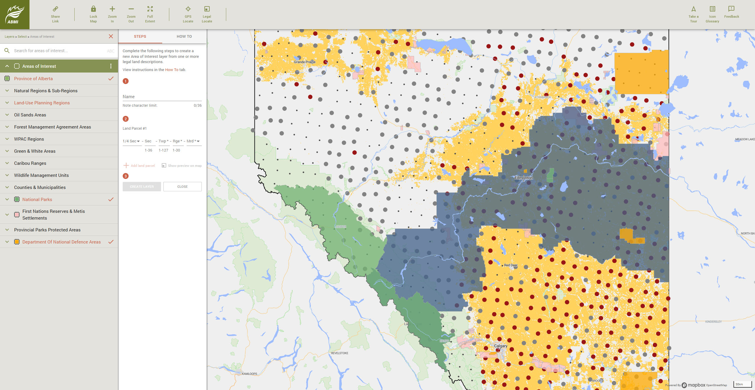
In terms of data, the new Mapping Portal provides convenient, interactive access to the ABMI’s Human Footprint Inventory and all of its 21 sub-layers, plus the ALPHA Wetland Inventory, Areas of Interest, as well as predicted relative abundance maps for hundreds of species. Additionally, the new Portal now includes:
- Layers that help to visualize and compare measures of habitat quality across the landscape. These include indicators of habitat suitability (species intactness, species richness, rarity-weighted species richness, non-native plant species richness, plus the estimated value of a given polygon to old-forest birds, increaser species, and decreaser species) and tools for assessing priority habitat for management consideration (climate refugia, priority native landcover, and priority human footprint types).
- Maps that show actual species occurrence. These complement maps of predicted relative abundance by showing detections and non-detections at ABMI monitoring sites.
- A completely rebuilt map engine capable of quickly rendering the 4.5 million+ polygons in our Human Footprint Inventory, in contrast to the ~60,000 polygons in the “heat map” approach of the old Mapping Portal. Among its many benefits, this allows both faster and more detailed rendering of the data, generation of summary statistics for custom areas or for features like seismic lines or wellpads, more viewing options, and more opportunity for additional functionality in future.
We’ve also added many new functions, including:
- The ability to navigate to a location using GPS coordinates or a legal land description.
- The ability to select and display multiple Areas of Interest at the same time.
- The ability to select and display multiple datasets at the same time, and easily customize the order in which they’re displayed—just drag and drop into the desired order.
- The ability to change the opacity of layers for easier viewing when stacked together.
- The ability to display summary statistics for human footprint data layers by Area of Interest, including customized Areas of Interest specified by the user.
To handle all of this new content, the updated Mapping Portal also includes various improvements to the navigation panel, as well as short “on the fly” explanations and how-tos that provide context and basic guidance. There’s a lot to take in, but we hope the many enhancements help to make it as straightforward as possible.
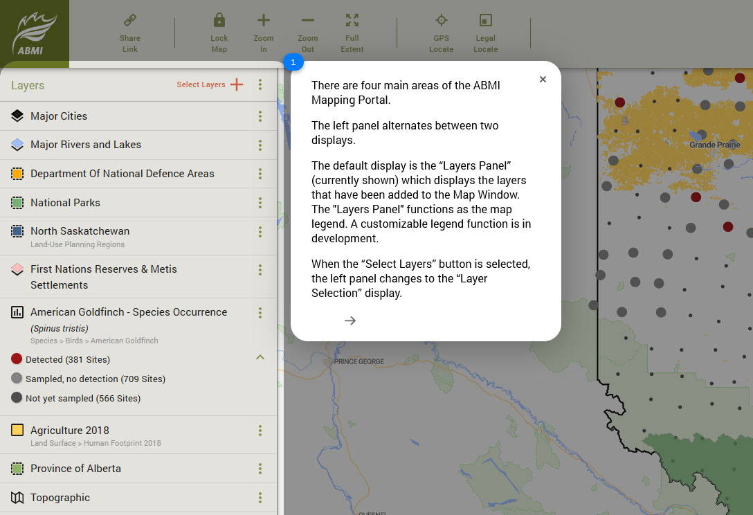
The updated Mapping Portal includes a detailed tour function to help you get started.
Over the coming weeks and months, we’ll be spotlighting some of the Mapping Portal’s new features. In the meantime, we hope you’ll jump in and explore. A great place to start is the new “Take a Tour” function in the upper right of the interface, which highlights and explains some of the main features. We’ll also be hosting a public webinar on March 26 @ 1 pm MT—register HERE for free.
Looking ahead, we’ll continue to expand and improve the Mapping Portal, and your feedback is a vital part of that process. Once you’ve spent some time on the new Portal, we hope you’ll also consider filling out the feedback survey available under “Feedback”, to let us know about your experience and what we can do to make it even better.